Paylocity Design System
Enhancing the complete User Experience with the Paylocity Design System
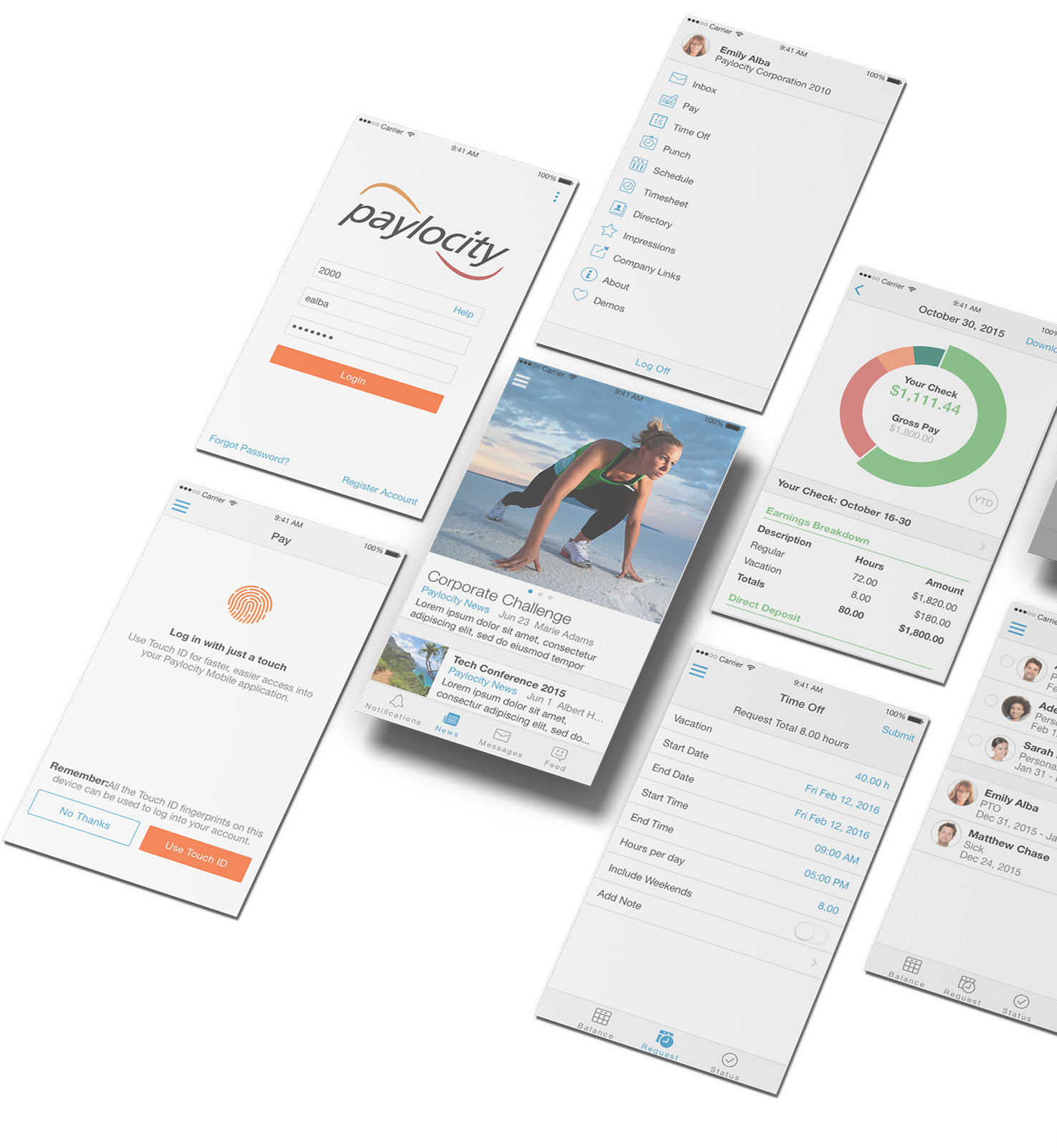
The Paylocity Design System project focused on creating a responsive UI framework optimized for desktop, tablet, and mobile devices. This comprehensive system supports the company's SaaS applications, enhancing user experience and ensuring consistency across various platforms.
My Role
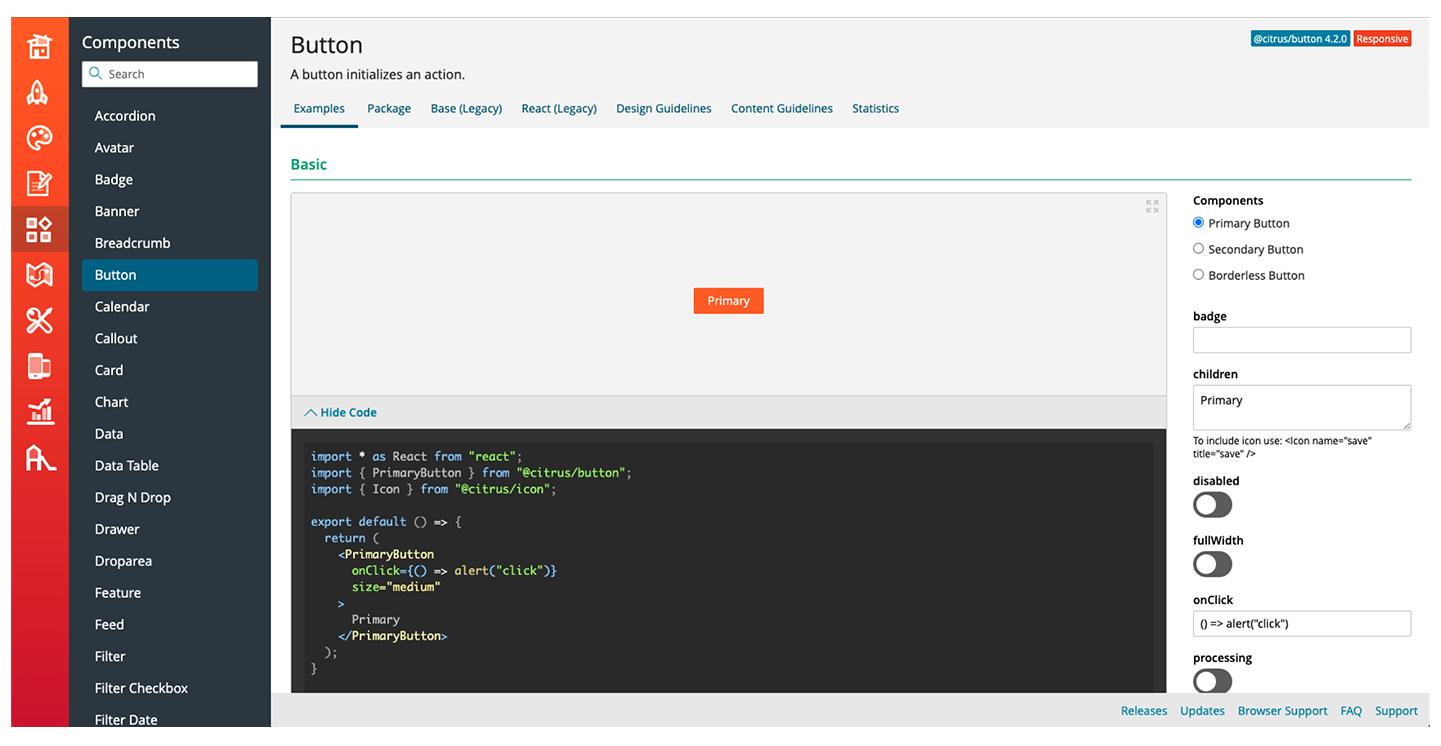
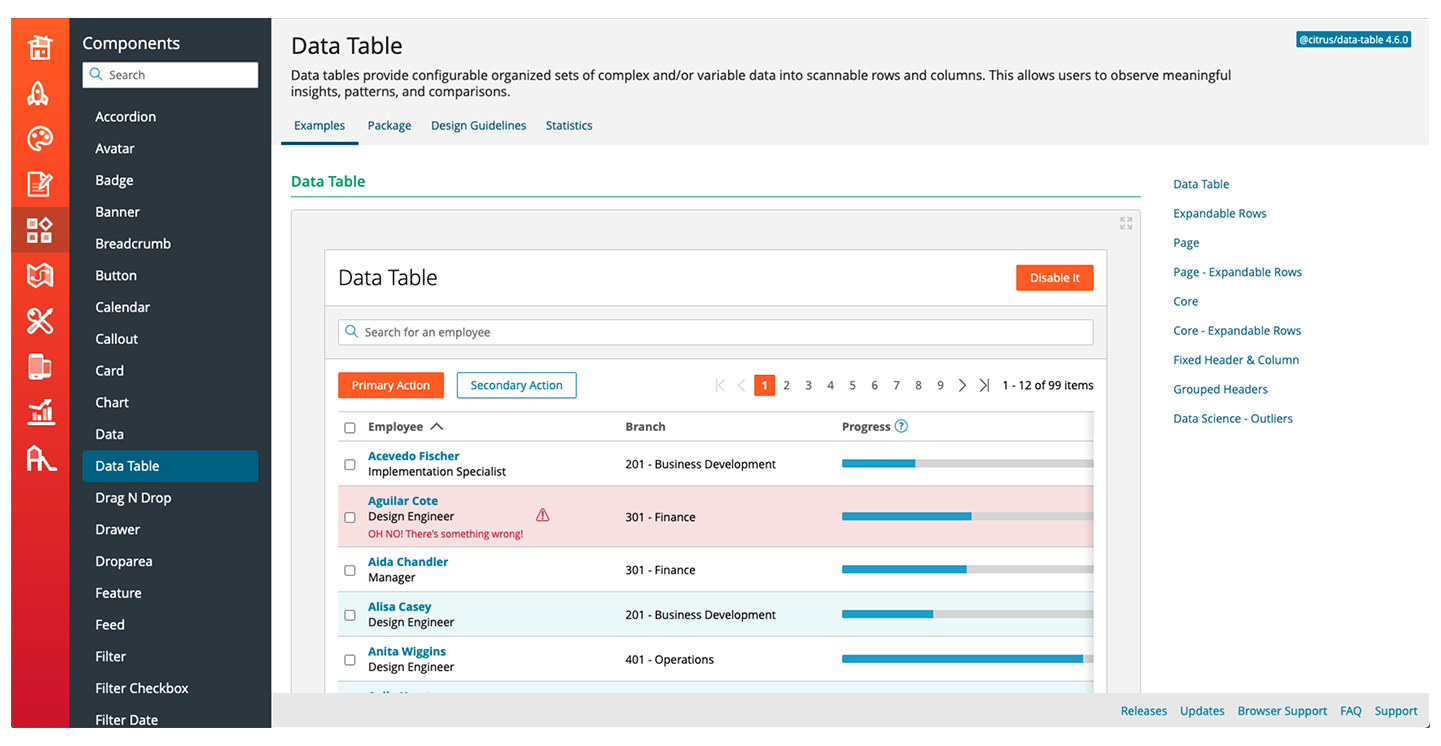
As a User Experience Developer & Designer, I played a pivotal role in establishing and maintaining a cutting-edge design system for Paylocity's SaaS applications. I led system design thinking for Benefits Administration, Human Resources, and Payroll categories, pioneering the Citrus front-end framework and design system, which was adopted by over 18 product teams across the US. Additionally, I designed and prototyped the complete redesign of all Paylocity SaaS products.
The Problem
The challenge was to develop a modern, intuitive, and responsive user interface for all of the SaaS product pages. The goal was to simplify navigation and data management while ensuring a seamless experience across different devices.
Research
Extensive research was conducted to understand user needs and best practices for responsive design. This included gathering feedback from existing users and analyzing competitor mobile applications.
Research Goals:
- Identify key features and functionalities required by users for managing employee information.
- Understand the best practices for responsive design across multiple devices.
- Determine the optimal layout and navigation structure for ease of use.
Research Findings:
- Users needed a clean and simple interface to manage large amounts of data efficiently.
- Responsive design was crucial to provide a consistent experience across desktop, tablet, and mobile devices.
- Incorporating dynamic elements like notifications and widgets enhanced user engagement and functionality.
Define
Based on the research findings, the following objectives were defined:
- Develop a responsive UI framework that adapts seamlessly to various screen sizes.
- Design an intuitive navigation system that simplifies access to key features.
- Ensure the interface is clean and organized, even with large amounts of data.
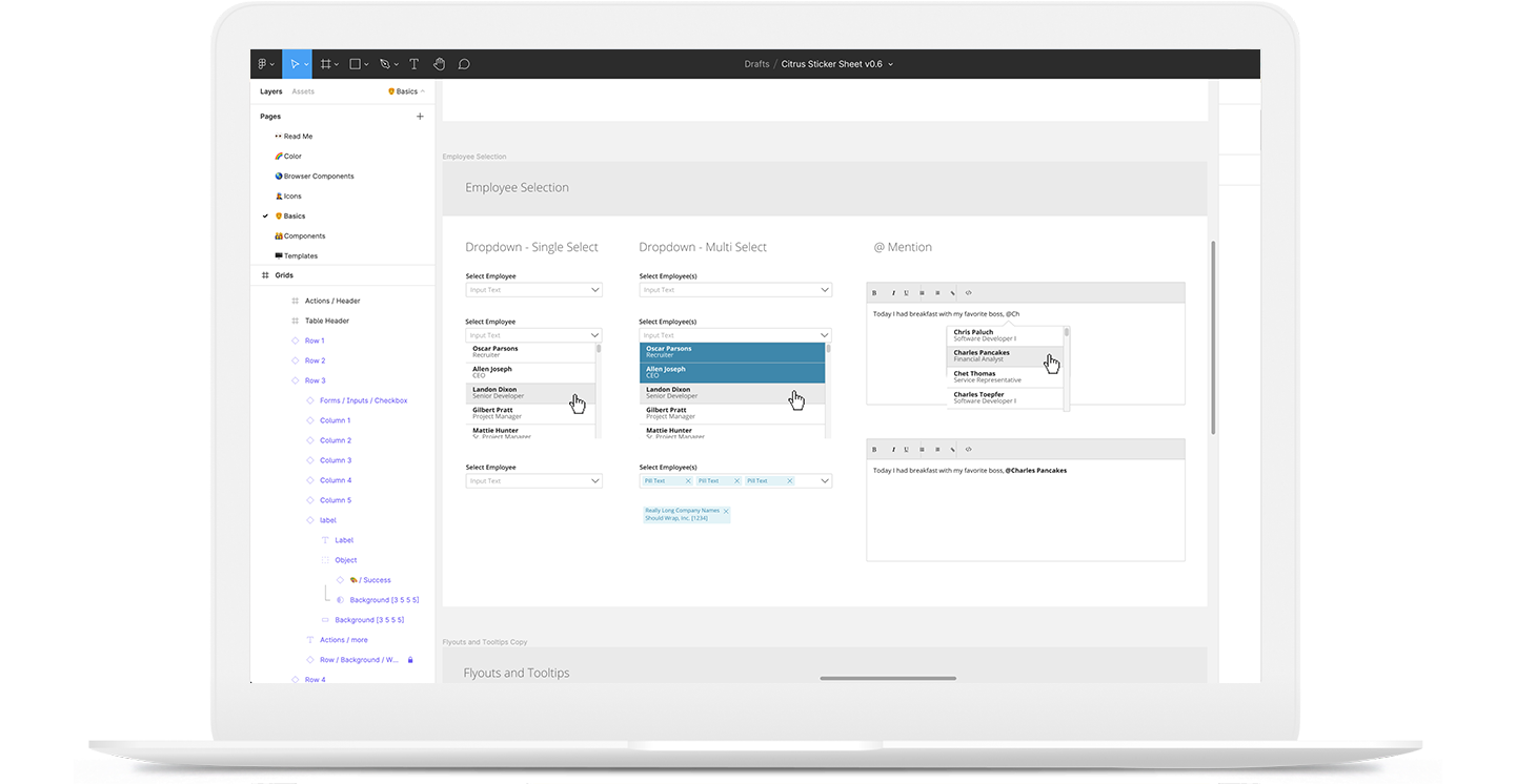
Wireframes
These wireframes focused on the three primary work areas: left (navigation), center (core content), and right (dynamic elements). User testing helped refine these prototypes to ensure an intuitive layout.
Design
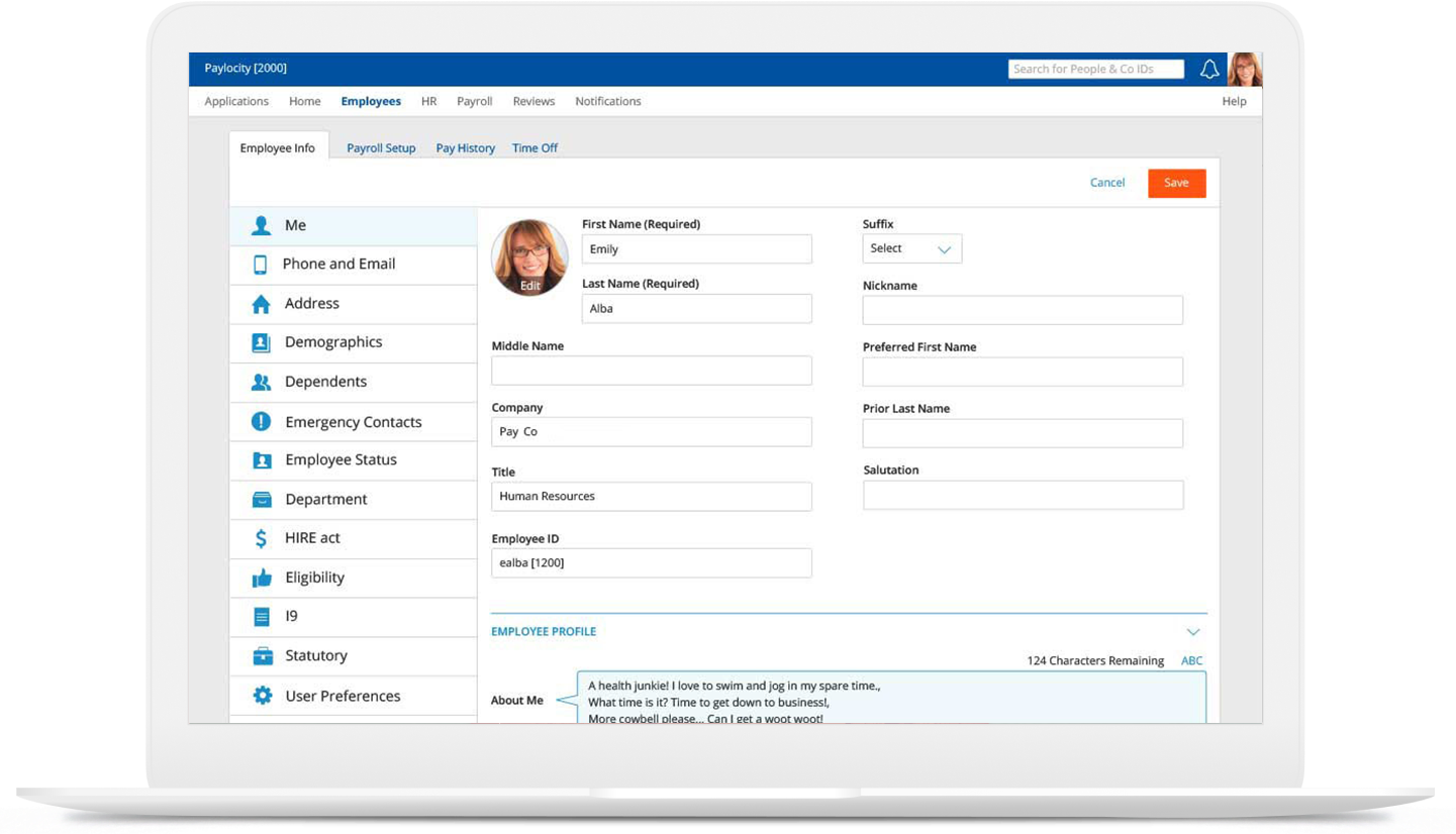
High-fidelity designs were developed, incorporating modern visual styles and a re-imagined navigation system. The design included read-only and editable sections, ensuring that users could easily manage and interact with their data. Special attention was given to charts, images, tables, and lists to ensure they adapted fluidly across devices.
Development
The UI framework was developed using HTML, CSS, and JavaScript. This included:
- Creating a responsive layout that adjusts seamlessly for desktop, tablet, and mobile devices.
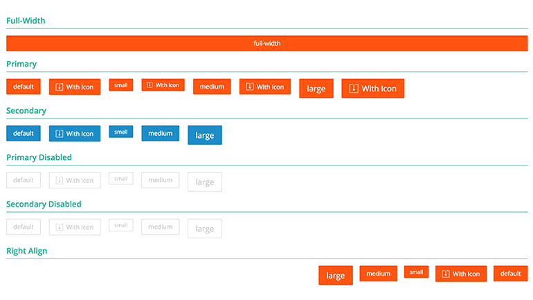
- Implementing a consistent design system across all SaaS applications.
- Developing components such as donut and bar charts for visual data representation.
Findings & Conclusion
The new design system was successfully implemented, providing users with an intuitive and responsive interface. The system's scalability and integrity ensured a consistent user experience across all platforms.
Outcomes
- Significant improvement in user satisfaction due to the intuitive and responsive design.
- Enhanced productivity as users could efficiently manage tasks and access information across various devices.
- Positive feedback from users and stakeholders, highlighting the improved usability and visual appeal.